Second State
A much-needed redesign of a beloved Charleston coffee shop to ease the overall flow and feel of the website, as well as the usability of their subscription service.
Background
Second State is beloved for its carefully curated roasting of coffee beans, pour-over coffee, and a simple, classic, “brooklyn-coffee-shop” aesthetic. However, their current website is not doing their business justice and could use a redesign to fix a few key user-experience errors.
Current Problem
The website for Second State is currently having user-flow difficulties, a subscription service that is complicated to use, and the responsiveness of the website is clunky.
My Role
I was the sole UI/UX designer for this 80 hour project.
Outcome
By the end of the project, I wanted to give the owners a website that represents their aesthetic and that they are proud of. I wanted to create an easy e-commerce experience for users to facilitate more coffee subscriptions and generate more revenue for the business. I also wanted Second State customers to easily find the information they seek on any device.
Discovery
My preliminary research began with a heuristic evaluation of the current website to understand what the core problems of the current website were. l then moved on to a competitor analysis to have a clear understanding of the current industry standard for coffee shop websites.
Preliminary Research
Heuristic Evaluation
In order to fully understand the difficulties that secondstatecoffee.com was experiencing, I completed a Heuristic Evaluation. The evaluation revealed that User Control and Freedom at the core of many of the websites issues.
Subscriptions
The subscription page was especially concerning as the UI for the quiz took over the page and left the subscriptions feeling less important. There also was not a clear understanding of the difference between “Subscription” and “Heavyweight Subscription”
Cart Experience
The original cart experience showed code for the product description. Also, there was no clear way of how to edit a subscription or information provided on how to cancel subscription once purchased.
Competitor Analysis
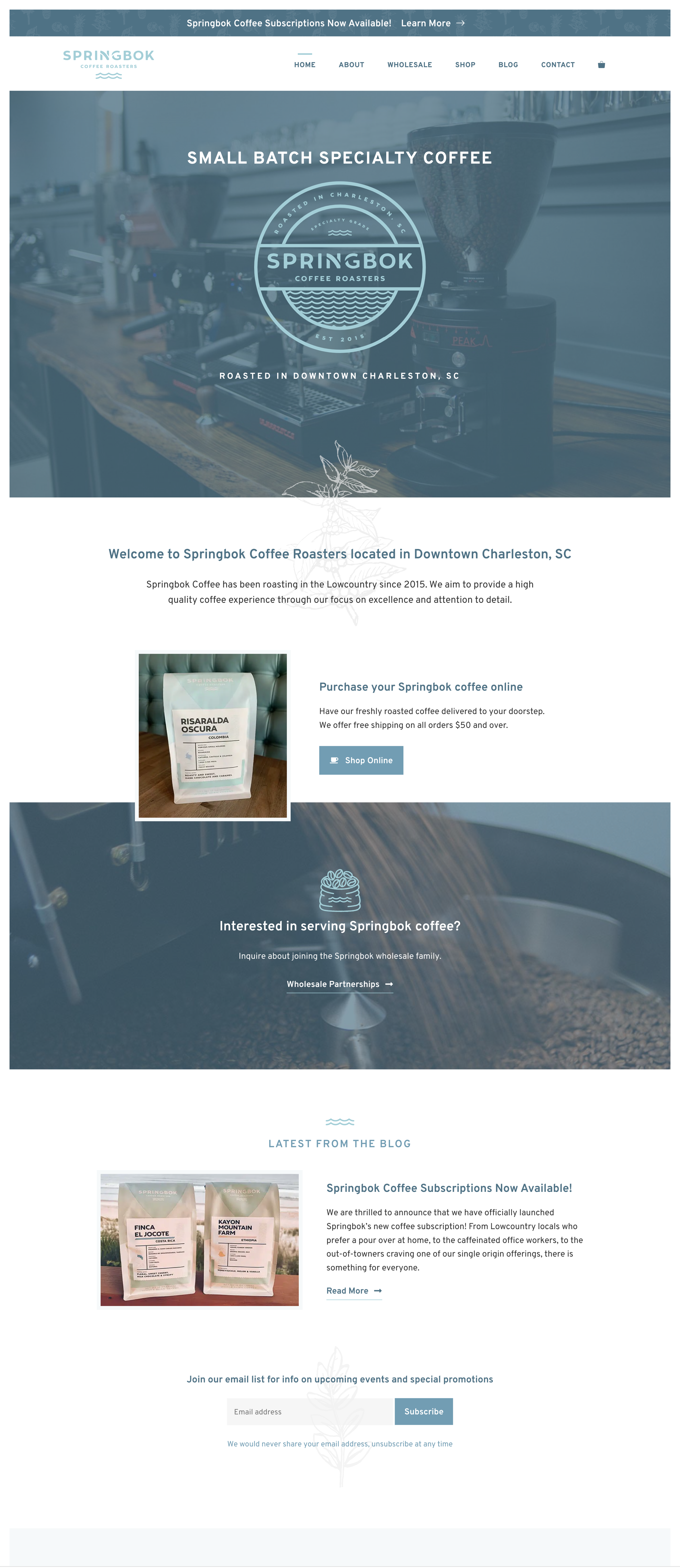
I reviewed 4 local coffee shop competitors to gain a clearer idea of what users are looking for in a coffee shop website. Key takeaways were the importance of branding and how the roasters picked a feature to primarily focus their attention on, like wholesale or merch.
Harbinger’s website boasted a highly branded aesthetic with a color palette and custom wallpaper that is even found on-site at the coffee shop itself.
Springbok is arguably Second State’s biggest competitor. They specialize in roasting and providing wholesale for local companies.
User Interviews and Usability Testing
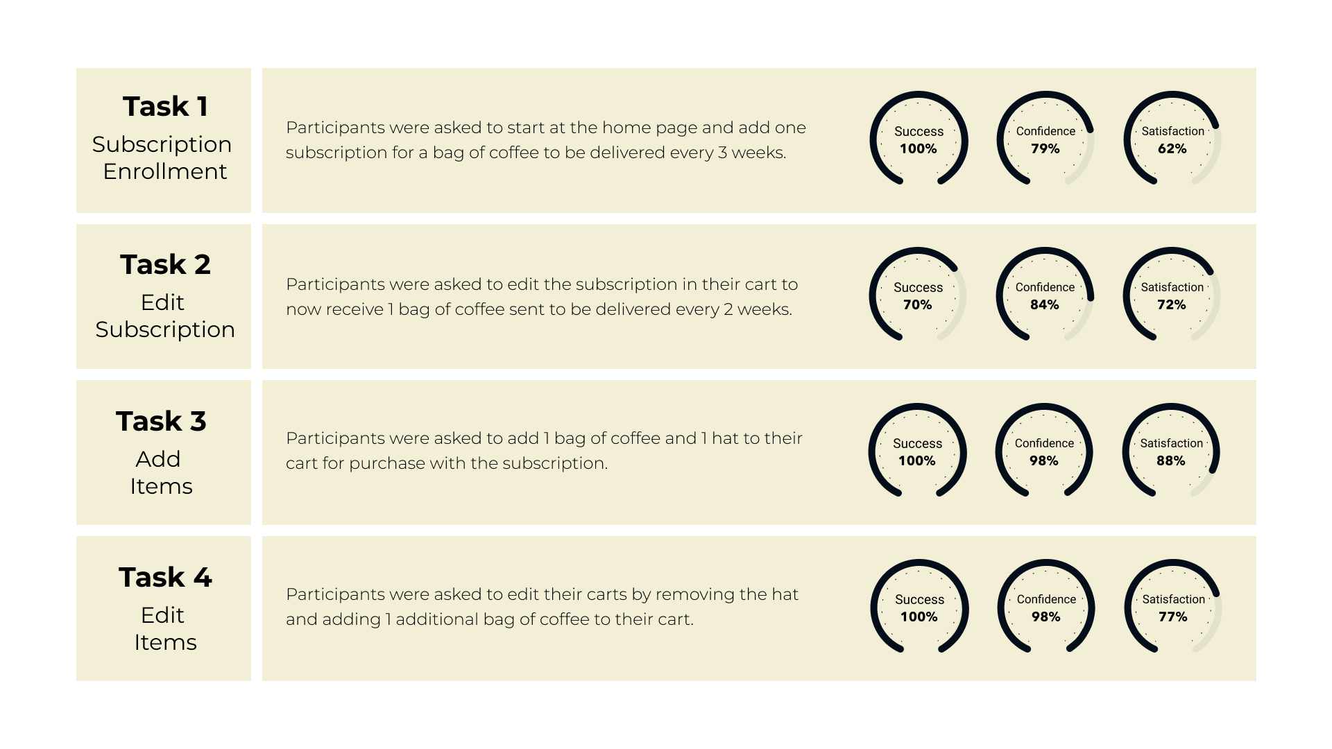
To gain a clearer understanding of what users desire in a coffee shop website, I conducted user interviews by asking several open-ended questions about their experience with using coffee shop websites. I then conducted a usability test by observing the participants complete 4 tasks on Second State’s current website and asking them to rate their experience in terms of confidence and satisfaction.
User Interview Questions
“When going to a new coffee shop you’ve never visited before, how do you like to find out more information about the business? Why?”
“What information do you look for? Why?”
“Where on the website would you expect to find that information?”
“Can you tell me about a time when you enrolled in a subscription service?”
“What was the enrollment process like?”
“How do you feel about drinking coffee and going to coffee shops?”
“What is your favorite coffee experience you’ve ever had?”
Affinity Map
Once the User Interviews were completed, I compiled the qualitative data into an affinity map to synthesize the core desires of coffee shop enthusiasts. I found 4 core themes: Usability, Vibe, Quality Experience, and Website Structure.
Usability Test Results
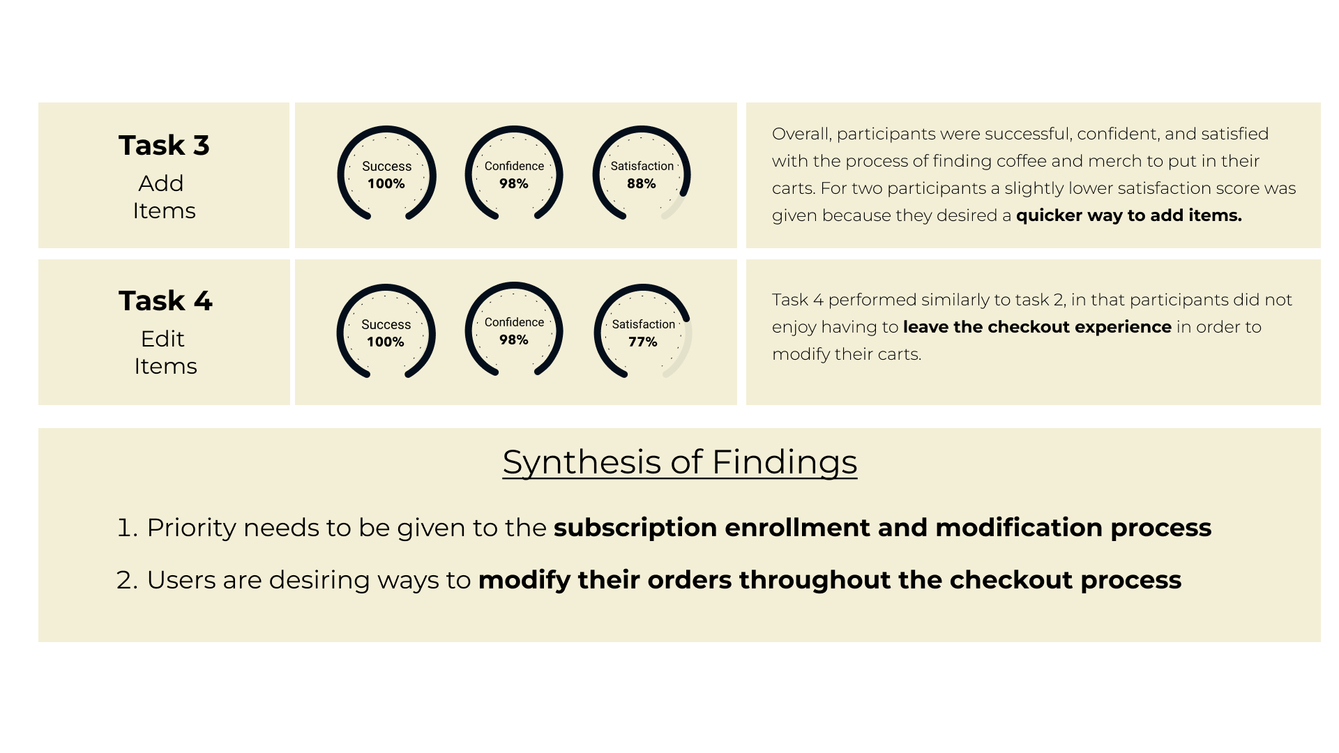
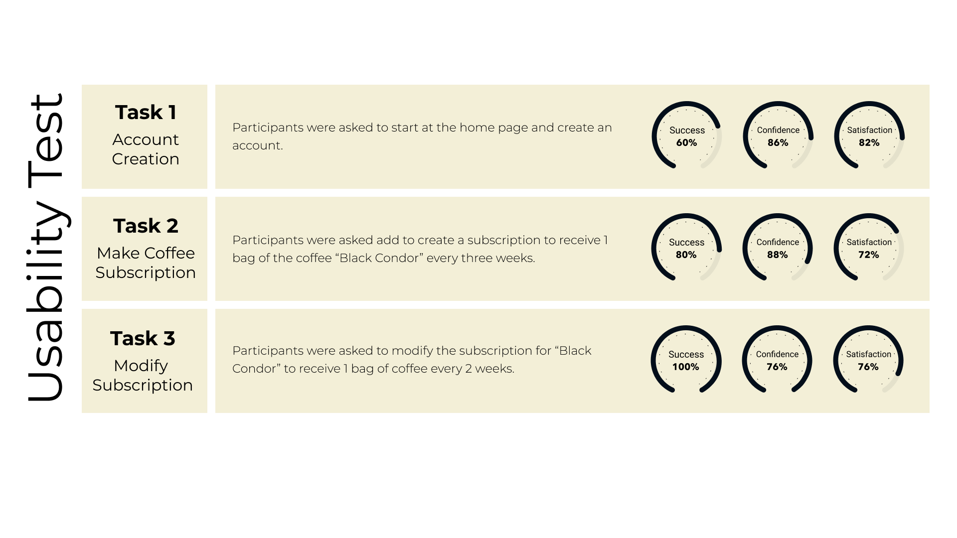
I compiled the quantitative data from the usability tests into visuals to better synthesize the findings. The data revealed that most of the redesign needed to be centered around the checkout and subscription user experience.
Define
With a clear understanding of what users desired, I began one of my favorite parts of the design journey: defining who I was designing for, empathizing with their needs and desires, and defining what problem to solve.
User Personas and Journey Maps
The data revealed two distinct user personas: Camille, the vibe and community lover, and Thomas, the quality and knowledge craver. I also utilized my empathy for each persona to create a user journey map as they sign up for a coffee subscription. Each of these assets helped me to narrow my thinking on who I was designing for.
How Might We and Point of View Statments
I developed one How Might We question and a Point of View statement for each user persona to narrow my thinking further. The POV statements were developed by considering the personas and synthesizing their core desire.
POINT OF
VIEW
Camille, a vibe and community lover, needs an increase in flexibility during the checkout process and subscription management to feel confident and satisfied.
Thomas, a quality and knowledge craver, needs to be able to modify and curate his coffee subscription experience to his preferences in order to feel confident and satisfied.
Considering the POV statements, I brainstormed 4 possible HMW questions to narrow in on what the core pain point for both user personas would be.
I settled on an HMW question that was narrow enough to keep my thinking on track, but still broad enough to allow room for exploration.
HOW
MIGHT WE
Increase flexibility during subscription management and checkout process?
Develop
After gathering data and developing user personas, journey maps, HMW, and POV statements, I was confident to move forward in deciding what features to redesign. My first step was to get all my ideas in one place with brainstorming.
Brainstorming
To come up with several solutions for the HMW question and free my thinking from judgment, I gave myself 20 minutes to come up with as many ideas as possible, including “not-so-sensible” ideas. When the timer was over, I analyzed the ideas and categorized them into “sensible” and “not-so-sensible".”
Impact/Effort Matrix
I used an impact/effort matrix to categorize the best ideas from my brainstorming. I went through this process with a software developer to ensure the effort needed to develop any of these ideas was considered before choosing what features to move forward with.
Redesign Prioritization
-
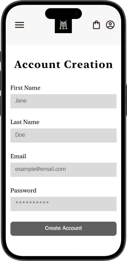
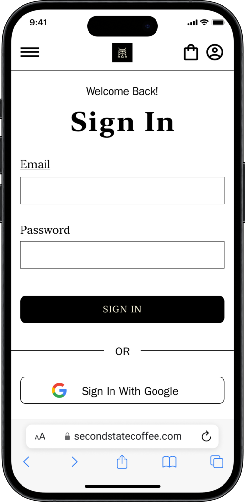
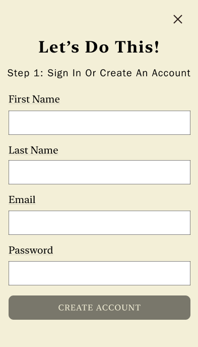
The ability to create an account will be added to the website. This will give users access to an account to give them more control over their subscription preferences.
-
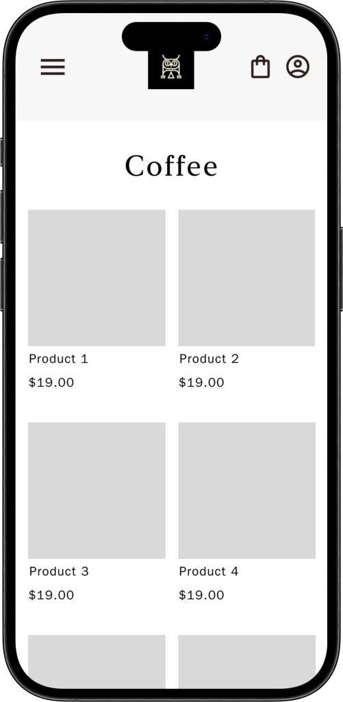
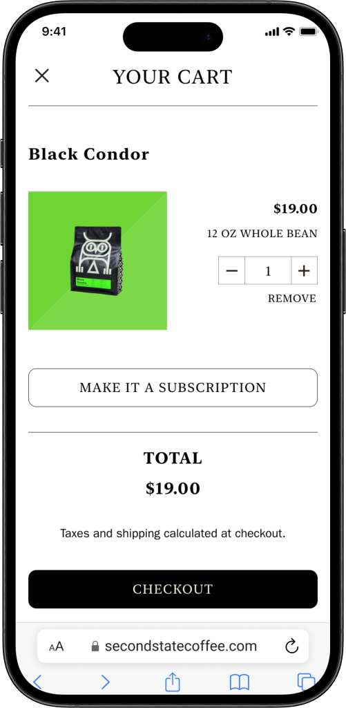
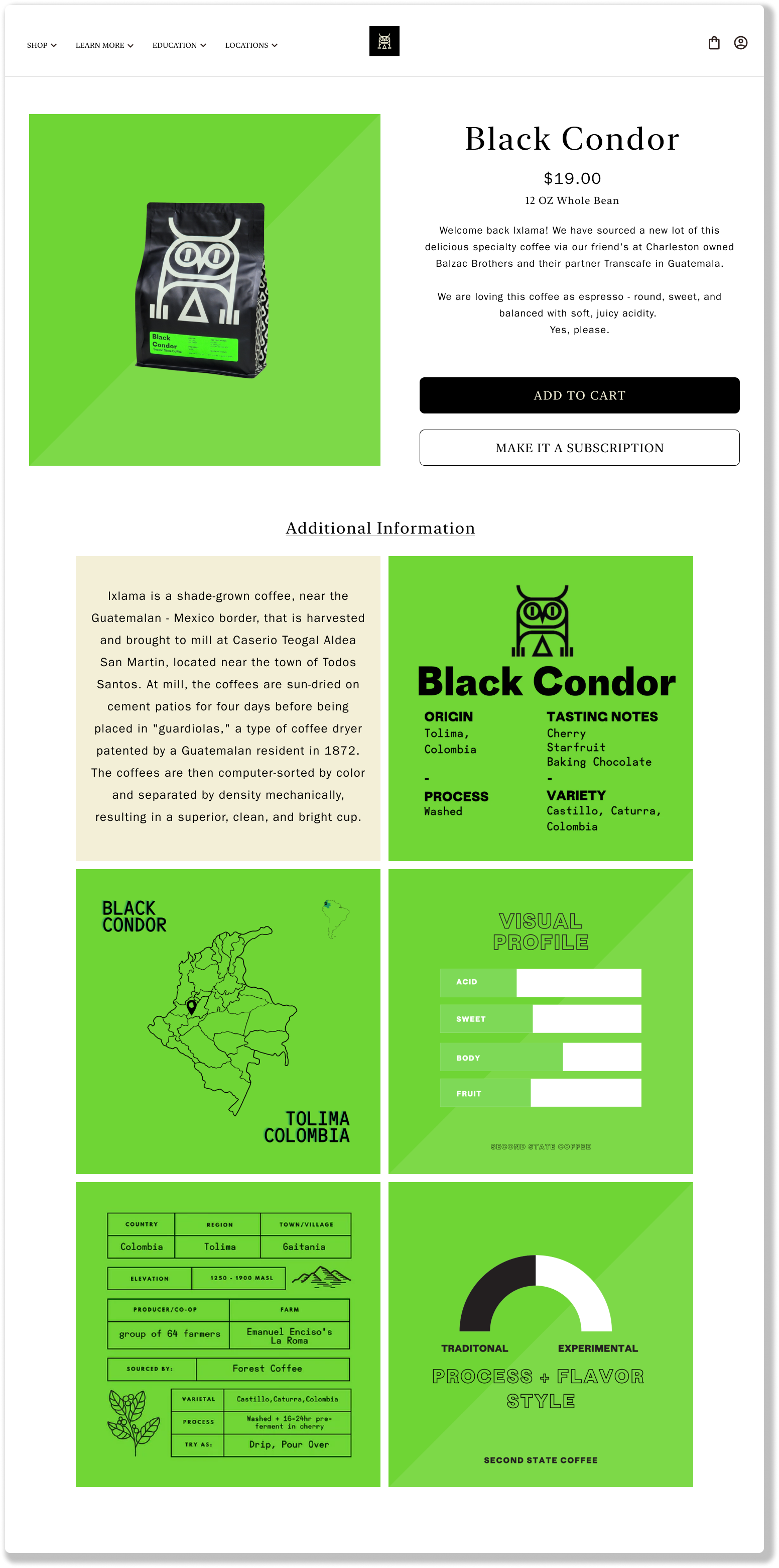
The subscription registration and modification process will be integrated into the account management feature. Registering for subscriptions will also be integrated into coffee description pages.
-
The user flows will be updated to integrate the user account feature, with special attention being given to the subscription process.
After considering all the synthesized data, I decided to move forward with three redesigns: Account creation, subscription service, and the overall user flow. Each of these priority redesigns keeps the user personas in mind by giving them more flexibility with their subscriptions and benefits the business by easing the user experience to promote more revenue.
Design
While designing, I wanted to maintain the already well-established and beloved brand that Second State had established. I focused my energy on the information architecture and user flows to ensure that the newly established account feature was integrated into their website successfully.
Information Architecture
I started with the site map of the current website, then considered the architectural needs of the priority redesigns as I developed a new sitemap. The new design is similar to the old sitemap but adds a “cart” and “account” page.
Before
After
The newly designed sitemap created the structure for the user flow. I focused on easing the subscription service by providing multiple ways to register for a subscription by giving users the ability to easily curate their own subscription experience by choosing the coffee, quantity, and frequency.
Using the user flow, I focused on three tasks needed to test the key redesigns: Creating an account, changing the frequency of a subscription, and making a coffee subscription from a product page. These tasks were used to inform what screens needed to move forward with development.
Task Flows
Low-Fidelity Wireframes
Using the task flows to inform what screens needed to be developed, I utilized the mobile-first design method to create several key screens for mobile. After iterating the mobile screens, I adapted the screens for desktop.
User Flow
Since the visual aesthetic and branding of Second State were known and beloved, I chose to maintain most of their current branding and UI elements. The main changes I made were with the consistency of the color palette and cleaning up their button design.
Branding
High Fidelity Wireframes
Drum roll please…the high-fidelity wireframes are finally here! To develop the high-fidelity wireframes, I used the UI kit to input the branding elements of Second State into the structure of the new designs.
High Fidelity
Prototype
Deliver
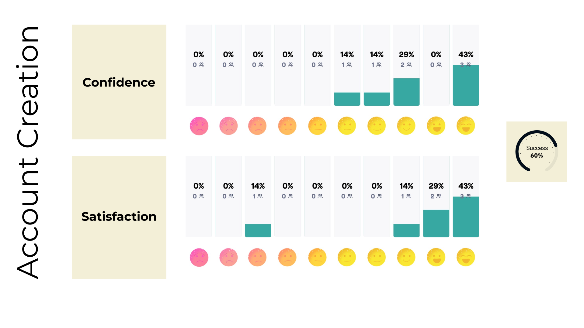
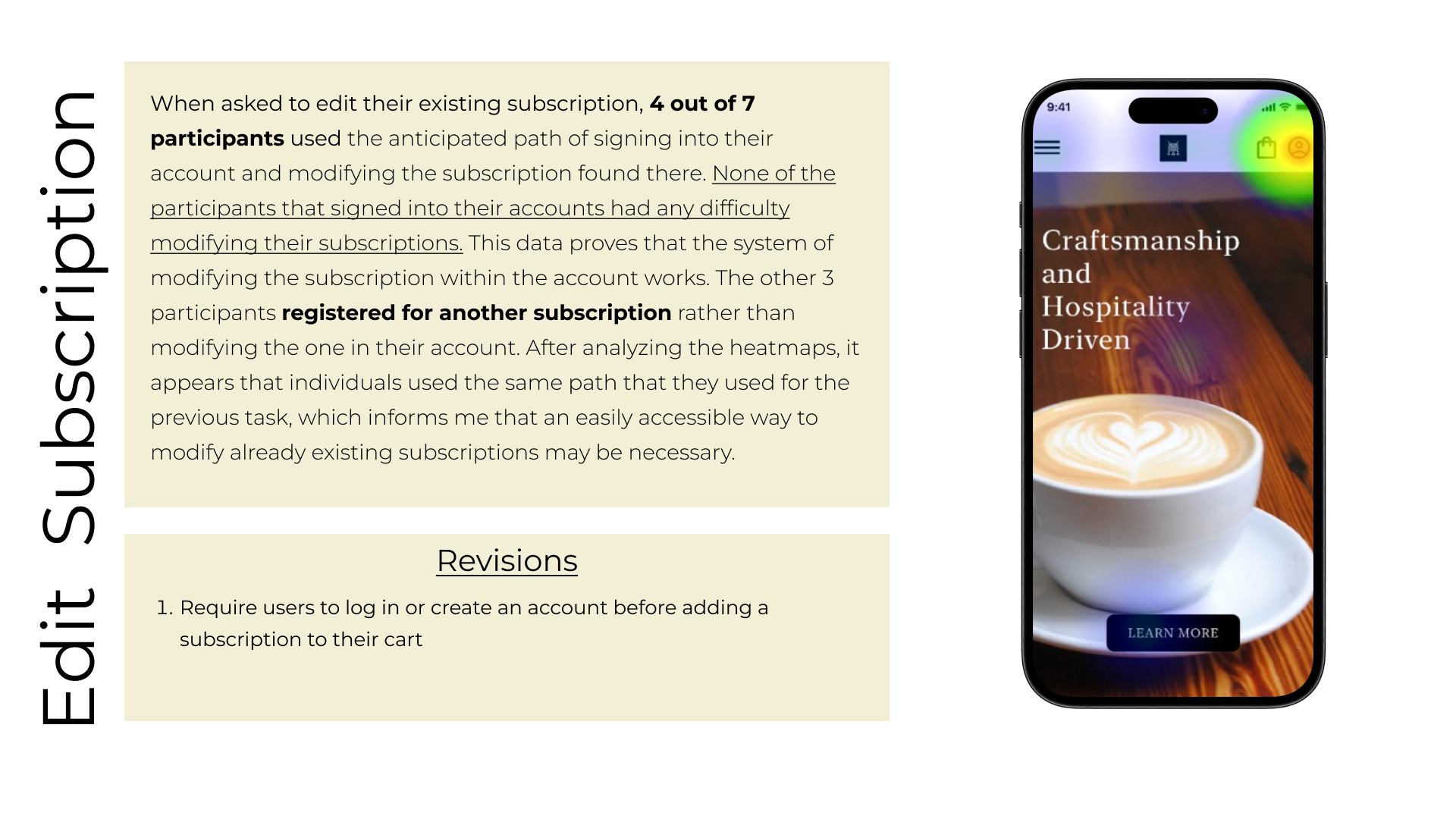
Once I felt confident that the prototype would successfully test the three task flows, I created an unmoderated usability test using Maze. The results were enlightening and informed my redesign decisions.
Usability Test Results
Revisions
I added an “Account” option in the menu to allow users multiple ways to access the account homepage.
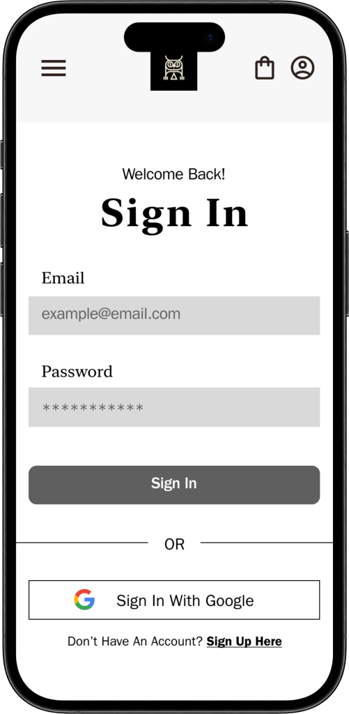
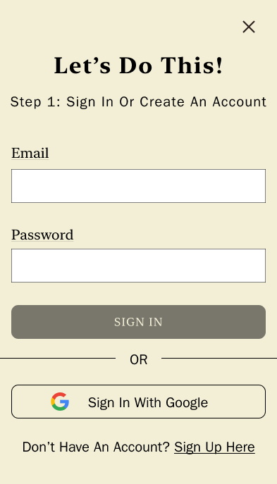
Within the subscription task flow, I added the ability to Sign In or Create an Account before adding a subscription to the cart. This will streamline the process and keep all the user’s subscription data in their account to give them more control.
A “Subscription” specific page was necessary to give users more information about subscription services and offer a starting point for signing up.
Conclusion
After 80 hours of researching, developing, testing, iterating, and testing again, I am very proud of the work I was able to create for a coffee shop that is a source of comfort for me. While I wasn’t able to work with the owners during this project, I hope to one day show them the revisions I’ve made and hopefully inspire a new beginning for their website. I feel confident the changes I researched and developed would give their business more revenue and provide more user satisfaction and confidence in their purchases with Second State.
Take Aways
This project was exciting to me because I was working within a “real-world” setting. While I wasn’t able to work with the owners of Second State, I still cared deeply about the business and wanted to provide a valuable product to the company to solve the UI/UX issues I found with their current website. I feel inspired to move forward in my UI/UX career and to continue helping businesses create user-friendly products.
Moving Forward
I hope to eventually make contact with the owners and share my designs and task flows with them. As I grow in my craft, I plan to come back to this project and iterate as needed.
Learning Moments
There were several moments throughout this project that I learned something new to implement within my design process for next time. One key moment that stands out was using Maze to conduct an unmoderated usability test. I thoroughly enjoyed using this software and found the data and insights it gave me invaluable to my iteration. However, next time I use Maze there are several changes I will make to ensure I am testing exactly what I want to test and to set participants up for success. For example, I tried to write my prompts for the tasks as succinctly as possible, but I fear that some participants may have been confused about what the task was I needed them to complete. Another learning moment was the amount of participants I received for the test. While I got 7 participants to complete the Maze, next time I want to get at least 20 participants for unmoderated usability tests to give me clearer data.
