Enrose was developed to provide young to middle-aged women with a product to help them feel more empowered through a greater understanding of their bodies.
Background
Why Women’s health?
After my own negative experience with hormonal birth control, I found answers through gaining a deeper understanding of my hormonal health. I was curious if other women felt just as confused as I did about hormones and if they wanted to learn more too. Thus began my journey…
Was it just me?
After conducting user interviews and compiling data into an affinity map, I discovered that users were interested in learning more about their hormones and how they affect their bodies, and wanted to feel they could trust the information they received.
Discovery
Competitor Analysis
I reviewed 3 competitors to reveal two key gaps in the women’s health market:
Desktop functionality is not typically available or does not provide all the features the mobile app does.
Current apps typically monitor menstrual health and do not provide insights about general hormone health.
Affinity Map
I conducted user interviews and compiled the data into an affinity map to determine the key areas of interest for users.
Control
Hormones
Knowledge
Normalization & Validation
Research
Define
User Persona
After compiling all the data from user interviews, I developed a core user persona. The pain points were especially interesting as they revealed that users want resources they can trust.
This persona was then used to inform HMW and POV statements. I developed a POV statement to synthesize the key viewpoint of the user persona.
Point of View
I’d like to explore ways to help young to middle-aged women understand more about how hormones affect their bodies because various symptoms make them feel out of control and they are curious if hormones may be the cause.
The HMW question was then developed to help narrow my thinking during the upcoming ideation phase and guarantee I developed a solution that solved for the core needs of the user.
How might We
Eliminate feeling out of control for young to middle-aged women when they experience various symptoms related to their hormones.
Develop
Using the user persona, HMW, and POV to guide me, I began to expand my thinking to explore various ways to solve for the user.
Storyboards
To explore the features further, I empathized with the persona through storyboards to understand how they may find out about the product and how they would use it.
Chloe looks for more information about hormones online but doesn’t feel she can fully trust the information she is reading. Her friend tells her about courses about hormones she has been taking. Chloe decides to enroll herself in one of the courses.
Chloe finds out about the product from a friend and decides to start using it herself in order to find out if various symptoms she’s been having have a hormonal cause.
Three Key Features
I chose 3 features to move forward with after brainstorming and considering the business, technical, and customer goals. Each feature solves the HMW by giving the user a better understanding of how hormones affect their bodies, which will help them feel less out of control.
Account Creation
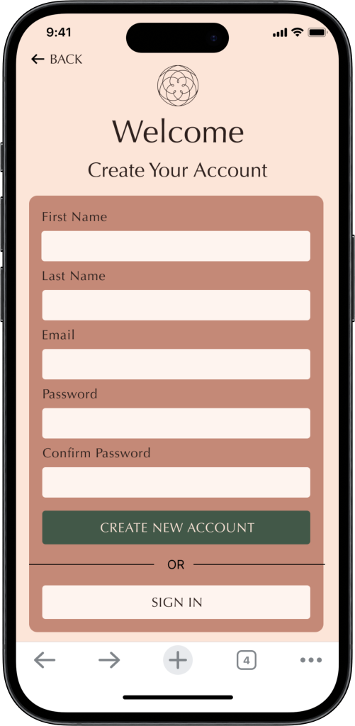
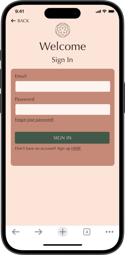
Users are desiring personalized health information they can trust. Through their account, users can access all their relevant data, weekly insights, and recommended courses.
Weekly Insights
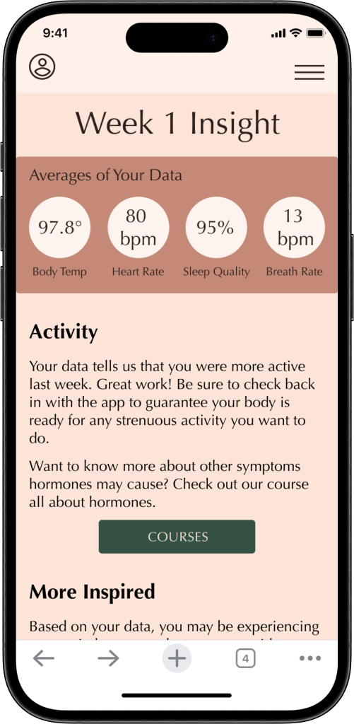
Provide weekly, individualized reports that are created by analyzing the users biometric data. The weekly insights will give users information about their current hormone health, possible symptoms, and recommended courses to take.
Biometric Data
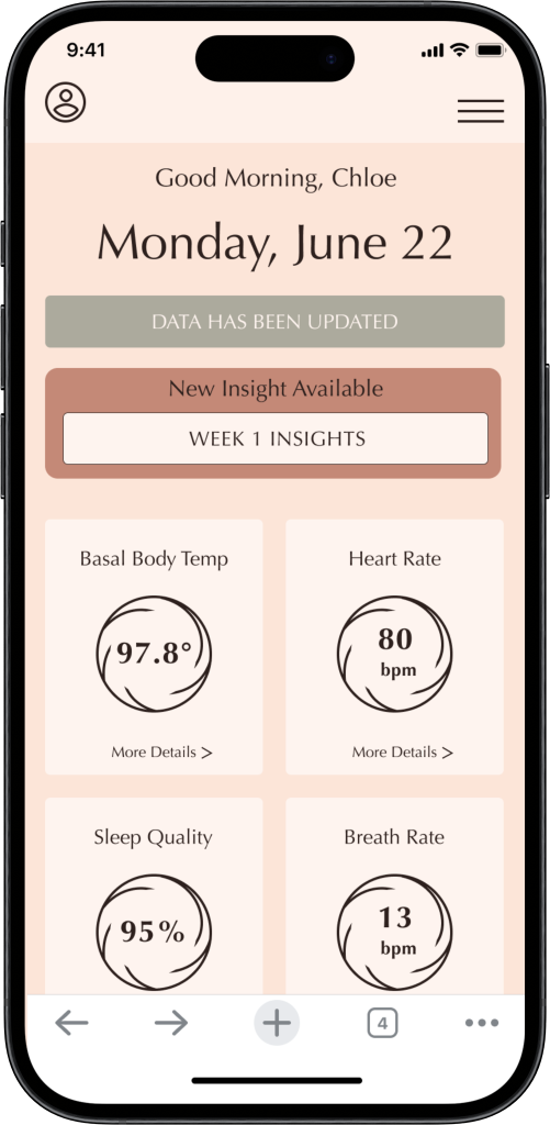
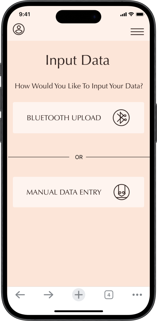
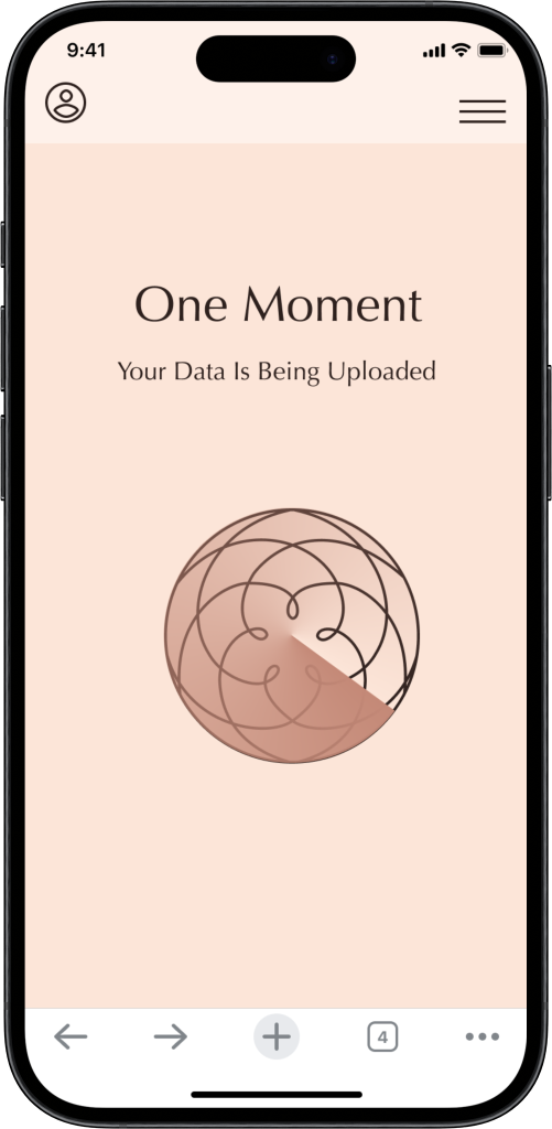
Users will be able to upload biometric data via bluetooth or by manually inputting the data. The data will then be used to analyze the users hormone health and provide them individualized weekly insights.
Project Goals
I considered the technical, business, and user goals to determine the best features to move forward with.
Brainstorming
I used 2 brainstorming methods to generate ideas for ways to solve the HMW question while considering the POV statement of the user persona.
Design
After conducting research, gathering and synthesizing the data to prioritize the user's needs and determining 3 key features to develop, I felt confident to move forward with the 3 key features.
Information Architecture
To set the project up for success, I began with information architecture to guarantee the product flowed smoothly and figure out what key screens needed to be designed.
Card Sort Study
I used Optimal Workshop to conduct a hybrid card sort study consisting of 37 topics and 5 categories.
I used a similarity matrix to understand how the majority of users organized the given topics.
5 Pre-determined Categories
Learn More
Shop Now
Account
Take a Course
Blog
Key Findings
The categories "account" and "courses" were confusing for users and may need to be renamed.
Since the topics placed into "Blog" and "Learn More" were similar, these two categories could be combined.
The "Take a Course" category needs to be re-examined and possibly placed within the "Learn More" category.
Site Map
I applied the findings from the card sort to determine the main categories users expect to see. When developing the site map I used Account, Learn More, and Log In/Sign Up as the main pages.
User Flows
Moving from the site map to the user flows, I focused on the three flows needed for the key features I was developing: account creation, weekly insights, and uploading biometric data.
Task Flows
Once the overall user flow was established, I narrowed in on the ideal flows users would take to accomplish the three key tasks: create a new account, view new weekly insight, and upload biometric data via Bluetooth.
The task flows revealed the key screens I needed to begin designing for. A homepage, account homepage, and weekly insights were where I set my focus.
Low-Fidelity Wireframes
Branding
I began with a mood board to explore color palettes and the general vibe of the website.
The name “Enrose” came from exploring cyclical themes found in nature and feminine imagery. To create Enrose, I combined the term “Enso”, which means togetherness, with rose, calling to the “rose of Venus” image.
Color Palette
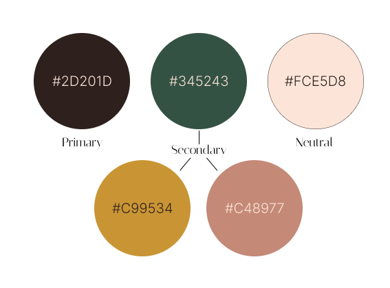
When exploring a color palette for Enrose, I wanted to find colors that felt feminine, organic, and calm.
Logo
I wanted to use a circular logo to represent the cyclical nature of women’s bodies. I used the shape of Venus’ track through the sky, which has been termed the “Rose of Venus.” I connected with the image and loved the connection to Venus, the planet of femininity.
UI components
I used the logo to influence the UI and component designs for Enrose.
Navigation Bar
Data Inputs
Icon Set
Button
High-Fidelity Wireframes
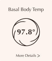
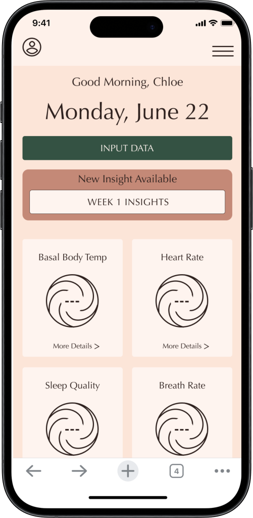
Using the mobile-first design philosophy, I focused my energy on designing high-fi wireframes for a mobile viewport. The low-fidelity wireframes were the backbone of the designs. I simply applied the UI elements to the low-fidelity wireframes and iterated as needed.
High FidelityPrototype
After developing high-fidelity wireframes, I put the frames into action with a prototype to perform a usability test for the 3 developed features.
Deliver
Usability testing was performed with 5 young to middle-aged women who were asked to complete 3 tasks: create an account, upload biometric data, and view weekly insight. All participants successfully completed the tasks, however, feedback from users revealed 2 areas of iteration needed.
To meet accessibility standards, all text on the maeve background was changed to a dark brown rather than light pink.
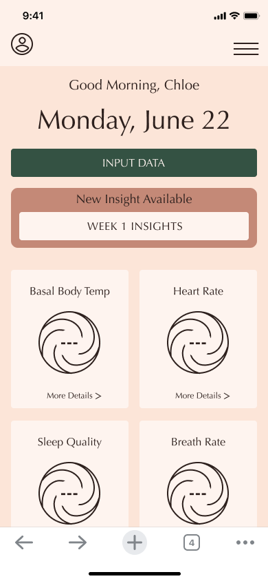
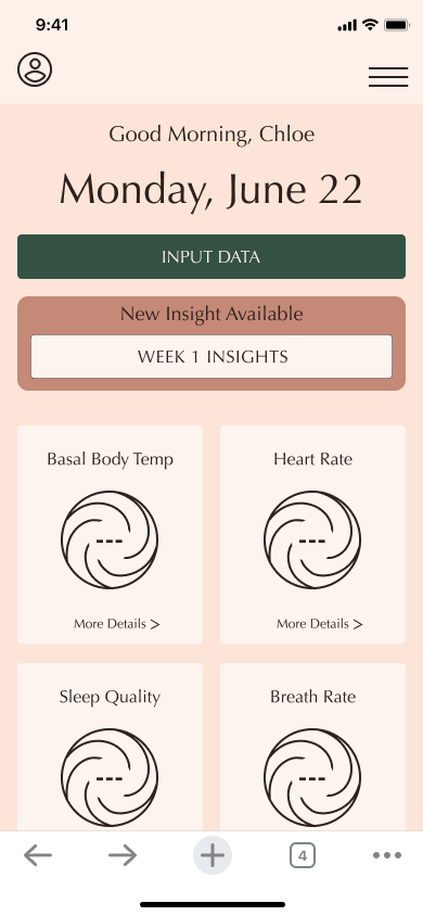
Some users were unsure if the “view weekly insights” button was a button. I added a brown stoke around the button to make the actionability more obvious.
Conclusion
Moving Forward
This project is near and dear to my heart. Not only because it is a product focused on one of my passions of women’s health, but also because it was my first end-to-end UI/UX project! I am so proud of the work I put into this project and love seeing it come to life. Moving forward, I hope to gain more skills in UI/UX and be able to come back to this product to fine tune and iterate.
Next Time
I learned so much from completing this project, and not just about women’s health. I am anxious to keep moving forward with my UI/UX career and utilize all that I learned about the design process for future projects. Next time, I will…
Keep in mind the big picture and maintain my confidence. Throughout this project, I found myself getting overwhelmed with the details and forgetting the core goal of the project I developed through my research.
Be more familiar with the design process, now that I’ve completed the process start to finish. I am the epitome of “hands on” learner. So having the chance to complete at least one UI/UX project will help me immensely moving forward since I’ll know where I am in the process as I move forward with the next project.
Find a topic and get specific. Being a more creative and big dreaming thinker, it can be difficult for me to get narrowed in on an idea and flush out the details. Next time, I will more easily know how to narrow down a topic to a specific problem to solve for.
